Wednesday 9 May 2012
Tuesday 20 March 2012
Final Draft of Website With Embedded Trailer

This is my final poster with my trailer embedded in it.
Sunday 18 March 2012
Feedback for first draft of trailer


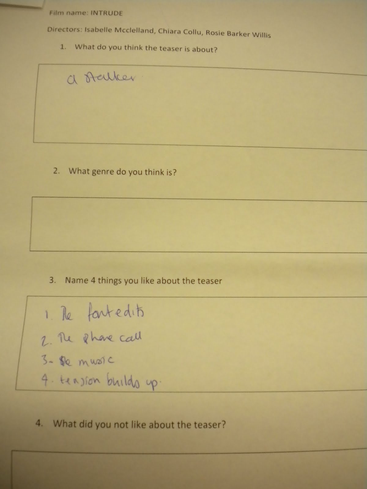
The over all feedback is quite positive and everyones reactions seemed to be quite positive. All of the feedback shwos that the audience knew what genre the trailer was and also what the basic story of the film was, which was a girl being posted dvds of recordings of her and him basically intruding in her life through stalking her. I'm very pleased with this result because it shows that we have achieved the codes and conventions of our chosen genre of Thriller/horror and edited the shots well enough so that the audience knows the rough story of the trailer.
Things that people liked most was the phone call, (which was created by recording me and issy faking an emergency services phone call throguh speakerphone and putting it onto the hard drive and adding it as music), they also liked the text imbetween shots such as "what would you do" and " if someone was recording your every move" ect. I am pleased with this because I think the language and effects for these texts are really effective as it complies with the conventions of a thriller especially as it flickers which gives a dark and disorientating effect.
Most of the feedback said to improve the length that the text is up for because some people found it hard to read. Furthermore, the breathing at the end was quite unrealistic and needs to be toned down and changed which is a reaosnable feedback because I agree. Lastly another thing that needs to be changed is the scream at the end due to most feedback sheets saying that it sounded quite unrealistic therefore maybe if we recorded the scream ourselves it will sound better and more realistic.
Role this week
This week we will be embedding our trailer into the website using the program Macromedia Dreamweaver. After doing this our group will also me going to the mews on the wednesday 21st March to continue editing our trailer using the feedback that we gained from the year 12's and the rest of the media class
Friday 16 March 2012
Website final draft with new picture

This is another website that I have created but this time I added two different pictures and faded them in with eachother. I did this because some of the feedback I recieved from my first website said the picture was quite plain therefore I have created this one. I need to get further feedback to decide which website to use however this is another possible choice of website.
Final draft of website

This is my final draft of my website. I have chosen to take in the feedback that was given to me and moved the billing box to the left hand side and the social media icons and have also moved the tagline at the top underneath the title. I have also made the tagline smaller because it was taking away the importance of the title being so big. The date line was also added and now i think the website looks very conventional and more professional however, on reflection i still think the website looks a little plain.
Subscribe to:
Posts (Atom)